Creating a Halftone Effect Using Tailwind CSS
Learn how to create a captivating halftone effect...
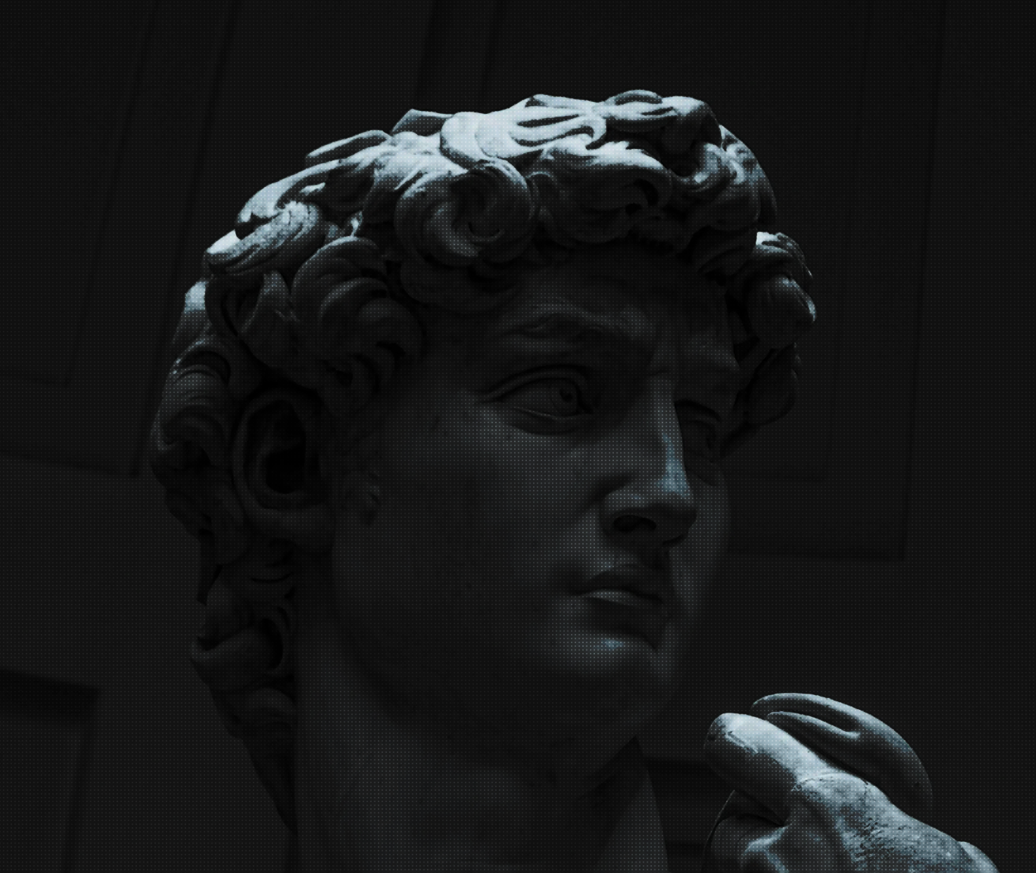
In this tutorial, we’ll explore how to achieve a striking halftone effect by overlaying a radial gradient pattern on top of an image using Tailwind CSS. This technique adds a textured, dot-matrix look to your images, bringing a unique visual flair to your web projects.
What is a Halftone Effect?
Before we dive in, let’s briefly explain what a halftone effect is. Halftoning is a reprographic technique that simulates continuous tone imagery through the use of dots, varying either in size, spacing, or pattern. Traditionally used in printing when full-color reproduction wasn’t possible, it’s now often used as a creative design element to add texture and visual interest to digital images.
Halftone patterns were originally used in newspaper printing and early photography to reproduce images using dots of varying sizes. Today, we’re using it as a creative effect in web design!
Interactive Halftone Effect Demo
Try adjusting the settings below to see how they affect the halftone pattern:
Step-by-Step Guide
1. Setup Your Project
First, ensure you have a project set up with Tailwind CSS. If you haven’t already, follow the Tailwind CSS installation guide to get started.
If you’re using Astro, you can easily add Tailwind CSS to your project using the following command:
npx astro add tailwind
2. HTML Structure
Create a section in your HTML where you want to apply the halftone effect. Here’s the basic structure:
<section class="relative space-y-6 mt-6 mb-8 isolate">
  <img
    src="/path/to/your/image.jpg"
    alt="Foreground Image"
    class="absolute inset-0 w-full h-full object-cover z-0"
  />
  <div
    class="relative z-10 bg-[radial-gradient(transparent_1px,#000_0.5px)] bg-size-[3px_3px] opacity-50 mix-blend-overlay h-full"
  >
  </div>
</section>
3. Understanding the Code
Let’s break down the key components of our HTML and CSS:
Section Container
<section class="relative space-y-6 mt-6 mb-8 isolate">relative: Establishes a positioning context for child elements.space-y-6: Adds vertical spacing between child elements.mt-6 mb-8: Adjusts top and bottom margins.isolate: Ensures the z-index of its children is isolated from other elements.
Background Image
<img
  src="/path/to/your/image.jpg"
  alt="Foreground Image"
  class="absolute inset-0 w-full h-full object-cover z-0"
/>
absolute inset-0: Positions the image to cover the entire section.w-full h-full: Ensures the image takes up the full width and height.object-cover: Maintains aspect ratio while filling the container.z-0: Places the image at the lowest z-index.
Halftone Pattern Overlay
<div
  class="relative z-10 bg-[radial-gradient(transparent_1px,#000_0.5px)] bg-size-[3px_3px] opacity-50 mix-blend-overlay h-full"
>
relative z-10: Positions the overlay above the image.bg-[radial-gradient(...)]: Creates the halftone effect using a radial gradient.bg-size-[3px_3px]: Sets the size of the dot pattern.opacity-50: Controls the intensity of the effect.mix-blend-overlay: Blends the pattern with the underlying image.h-full: Ensures the overlay covers the entire height.
Customization Options
You can easily customize the halftone effect by adjusting a few parameters:
- Pattern Size: Change
bg-size-[3px_3px]to increase or decrease the size of the halftone dots. - Opacity: Modify
opacity-50to make the effect more or less pronounced. - Dot Colors: Adjust
bg-[radial-gradient(transparent_1px,#000_0.5px)]to use different colors or transparency levels. - Blend Mode: Experiment with different blend modes like
mix-blend-multiplyormix-blend-screenfor varied effects.
Use the color picker above to choose a color for your halftone pattern. You can then use this color in your radial gradient.
Conclusion
By leveraging Tailwind CSS and some creative CSS techniques, we’ve created a captivating halftone effect that can add depth and texture to your web designs. This effect is particularly useful for hero sections, card backgrounds, or anywhere you want to add a touch of vintage or artistic flair to your images.
Remember to experiment with different settings to find the perfect balance for your specific design needs. Happy coding!
Last updated: 10/16/2025